Rebranding
CDON 2.0
Rebranding and UX overhaul of a large-scale marketplace with the goal of improving product discovery, reducing cognitive load, and creating a clearer path to purchase.
The project focused on restructuring the homepage and navigation to better reflect user intent rather than internal organization, while balancing commercial pressure from ongoing campaigns.
Year :
2023
Industry :
E-commerce
My role:
UX Designer (strategy, key interaction decisions)
The Problem:
CDON’s digital experience felt outdated and inconsistent.
Key issues:
Inconsistent UI patterns created cognitive friction
Navigation and product discovery were harder than necessary
Trust and brand perception were weakened by design inconsistency
Visual identity lacked clarity and modern appeal

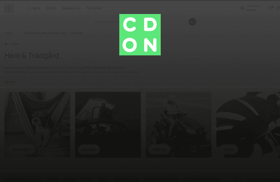
Homepage before

Product details page before
Goals
Goals from UX:
Modernize the brand expression
Create a cohesive and scalable design system
Improve usability and product discovery
Strengthen trust and perceived credibility
Process
01.
Audit & Insight
The work began with a comprehensive audit of CDON’s existing experience to understand where usability and brand perception were breaking down. I reviewed key user flows, navigation patterns, and visual consistency across the platform, while benchmarking modern e-commerce competitors to identify gaps and opportunities. The audit revealed friction in product discovery, inconsistent UI patterns, and a visual language that weakened trust.

02.
Brand Translation
With these insights, I translated the refreshed brand direction into a modern digital expression. Typography, color usage, and spacing were refined to improve readability, accessibility, and clarity while establishing a cleaner and more contemporary aesthetic aligned with current user expectations.

03.
UX Redesign
I redesigned the core browsing experience to support faster scanning and decision-making. Navigation was simplified, product listing hierarchy improved, and filtering structures clarified. Visual trust signals were strengthened to increase confidence and reduce hesitation during browsing.

04.
System & Consistency
To ensure long-term scalability and cohesion, I introduced reusable components and standardized interaction patterns. This established a consistent UI foundation that supports future development while maintaining a recognizable and trustworthy experience across the platform.
05.
Aftercare & Feedback
After launch, I monitored user feedback and behavioral signals to evaluate how the redesign performed in real use. Insights from stakeholder input, usability observations, and early user reactions helped identify minor friction points and opportunities for refinement. This continuous feedback loop ensured the experience could evolve and improve over time.
Key Improvements
Before:
Fragmented visual language
Weak hierarchy
Cluttered layouts
After:
Modern, clean interface
Cohesive brand expression
Scalable design system
Clear visual hierarchy

Homepage after

Product details page after
Problem :
Content
Solution :
Content
Challenge :
Content
Summary :
Content
Rebranding
CDON 2.0
Rebranding and UX overhaul of a large-scale marketplace with the goal of improving product discovery, reducing cognitive load, and creating a clearer path to purchase.
The project focused on restructuring the homepage and navigation to better reflect user intent rather than internal organization, while balancing commercial pressure from ongoing campaigns.
Year :
2023
Industry :
E-commerce
My role:
UX Designer (strategy, key interaction decisions)
The Problem:
CDON’s digital experience felt outdated and inconsistent.
Key issues:
Inconsistent UI patterns created cognitive friction
Navigation and product discovery were harder than necessary
Trust and brand perception were weakened by design inconsistency
Visual identity lacked clarity and modern appeal
Homepage before
Product details page before
Goals
Goals from UX:
Modernize the brand expression
Create a cohesive and scalable design system
Improve usability and product discovery
Strengthen trust and perceived credibility
Process
01.
Audit & Insight
The work began with a comprehensive audit of CDON’s existing experience to understand where usability and brand perception were breaking down. I reviewed key user flows, navigation patterns, and visual consistency across the platform, while benchmarking modern e-commerce competitors to identify gaps and opportunities. The audit revealed friction in product discovery, inconsistent UI patterns, and a visual language that weakened trust.
01.
Audit & Insight
The work began with a comprehensive audit of CDON’s existing experience to understand where usability and brand perception were breaking down. I reviewed key user flows, navigation patterns, and visual consistency across the platform, while benchmarking modern e-commerce competitors to identify gaps and opportunities. The audit revealed friction in product discovery, inconsistent UI patterns, and a visual language that weakened trust.
01.
Audit & Insight
The work began with a comprehensive audit of CDON’s existing experience to understand where usability and brand perception were breaking down. I reviewed key user flows, navigation patterns, and visual consistency across the platform, while benchmarking modern e-commerce competitors to identify gaps and opportunities. The audit revealed friction in product discovery, inconsistent UI patterns, and a visual language that weakened trust.
02.
Brand Translation
With these insights, I translated the refreshed brand direction into a modern digital expression. Typography, color usage, and spacing were refined to improve readability, accessibility, and clarity while establishing a cleaner and more contemporary aesthetic aligned with current user expectations.
03.
UX Redesign
I redesigned the core browsing experience to support faster scanning and decision-making. Navigation was simplified, product listing hierarchy improved, and filtering structures clarified. Visual trust signals were strengthened to increase confidence and reduce hesitation during browsing.
04.
System & Consistency
To ensure long-term scalability and cohesion, I introduced reusable components and standardized interaction patterns. This established a consistent UI foundation that supports future development while maintaining a recognizable and trustworthy experience across the platform.
05.
Aftercare & Feedback
After launch, I monitored user feedback and behavioral signals to evaluate how the redesign performed in real use. Insights from stakeholder input, usability observations, and early user reactions helped identify minor friction points and opportunities for refinement. This continuous feedback loop ensured the experience could evolve and improve over time.
Key Improvements
Before:
Fragmented visual language
Weak hierarchy
Cluttered layouts
After:
Modern, clean interface
Cohesive brand expression
Scalable design system
Clear visual hierarchy
Homepage after
Product details page after
Problem :
Content
Solution :
Content
Challenge :
Content
Summary :
Content